ELM HILL
Brand Identity + Web Design

About the Client
FS+ (Furniture Solutions Plus) partnered with ACG Studio to modernize their brand and better reflect their position as a forward-thinking, open-line commercial furniture dealer. The result: a flexible identity system, updated logo, refined color palette, and clear, confident voice.

Logo + Brand Mark
The brand mark is a geometric, modernist symbol designed for clarity, scalability, and versatility. Constructed on a precise grid system, it emphasizes balance and clean proportions, allowing it to function effectively across both print and digital formats. By abstracting the “plus” symbol into a simplified, standalone form, it communicates the brand’s value-added approach without redundancy. Its minimal, modular design aligns with the brand’s focus on contemporary, thoughtful interiors and serves as a distinctive identifier in both corporate and architectural settings.
The logo was redesigned to reflect a more contemporary and focused brand identity. By removing the redundant “P” from the original logo, the new logo streamlines the wordmark and emphasizes the brand’s core offering—Furniture Solutions, plus more. The integration of the custom brand mark in place of a traditional plus sign adds a unique visual element that reinforces the company’s commitment to thoughtful design.
The “Furniture + Solutions” logo variation introduces the brand mark as a connective element between the two core pillars of the business.


Typography + Color
The FS+ rebrand introduces a modern typography system and evolves the color palette to better reflect the company’s contemporary vision. The primary typeface, Modern Era, brings clean, geometric structure with just enough warmth to feel human and accessible—ideal for a brand rooted in thoughtful interior design. Supporting this, Pitch Sans adds contrast and strength in bold moments, helping establish hierarchy and clarity across applications.
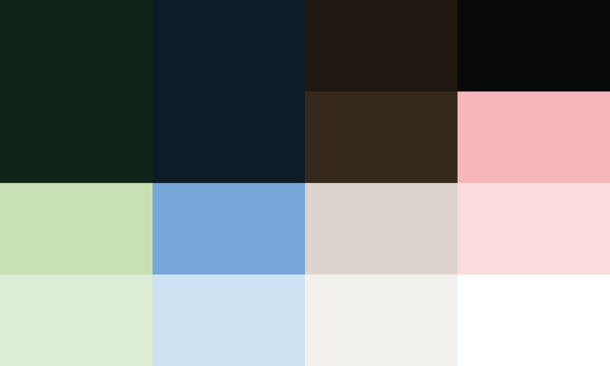
Visually, the new color palette moves away from the brand’s original blue and green tones, which had begun to feel dated. Instead, it introduces a more curated and layered set of hues—pairing fresh, light shades like chartreuse and sky with grounding tones such as navy, dark green, and timberwolf. This blend evokes natural materials and sophisticated interiors, aligning the brand’s look and feel with its mission to revitalize workspaces. Together, the type and color work in harmony to present FS+ as both elevated and approachable.
Branding In Use
Every expression of the FS+ brand was designed to feel purposeful, modern, and quietly confident.

