Branding & Design
NC Matters
A UNC CREATIVE Project
Real-time, perinatal psychiatric resources and consultation for primary care providers in obstetric, pediatric, family medicine, and psychiatric clinics.
View Project


Small City Innovators
Branding
A podcast that celebrates the people and ideas empowering the small city movement.
View Project
Happy Hour Speaker Series
for Vert & Vogue
As part of Third-Friday in Durham, North Carolina, Vert & Vogue hosts a monthly Happy Hour and invites special guest speakers to share their stories and perspectives to the community. The community thus has an opportunity to gather and celebrate the diversity of our community.

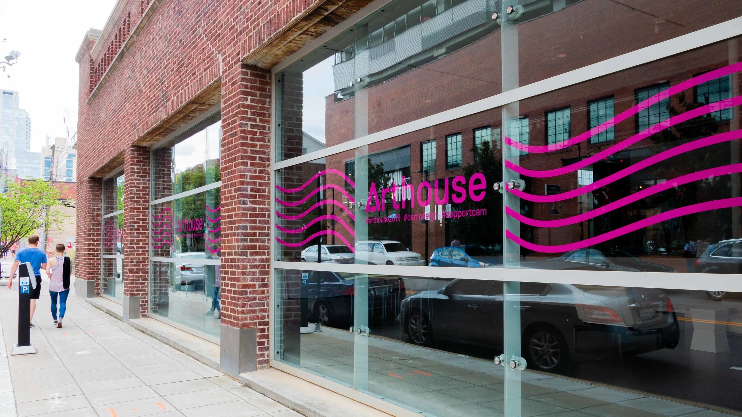
Arthouse 2019
for CAM Raleigh
Arthouse is the annual art gala and fundraiser for the Contemporary Art Museum in Raleigh, NC (CAM Raleigh). CAM Raleigh’s mission: “CAM Raleigh is the non-collecting contemporary art museum that provides an environment for transformation through educational programs, cultural experiences, and bold, non-traditional exhibitions by living artists.”
Weekly Email Campaigns
for Vert & Vogue
Vert & Vogue is a boutique in Durham, NC offering upscale-casual contemporary clothing for women and men. V&V sources their goods with an abiding focus on natural fibers, quality construction, timeless design and American-made production. More than half of their collection is made in the USA. V&V supports independent designers and artisans that produce on a small scale and drive green innovation in the fashion industry. The storefront is located in downtown Durham. Vert & Vogue is proud to be a certified B Corp meeting rigorous standards of social and environmental performance.
Contact for more sample work.


Past Branding Projects
for Deutsch-Blanco Law PLLC
Deutsch-Blanco Law PLLC’s is an immigration and civil law firm. The law firm maintains a balanced position, in terms, of sophistication and compassion towards it's clients. As a beacon of hope and a fortress for its patrons, Deutsch-Blanco respects and learns from the past while promoting progress and diversity.
The Deutsch-Blanco mark is a modern interpretation of a rotunda that emphasizes its cultural and international involvement. The rotunda encompasses Deutsch-Blanco's initials and alludes to the law attorney's academic roots and community in Chapel Hill, North Carolina.


Occluded Front
for UNC Art Exhibition
Occluded Front is a group exhibition presenting work from the winners of the Undergraduate Studio Art Awards competition held in November 2017 in at the University of North Carolina at Chapel Hill. The exhibition is on display at the John and June Allcott Undergraduate Gallery in Chapel Hill, NC from March 1st - 18th, 2018. The graphics reflect the minimalist cohesion of the artists on display.
i.
ii.
iii.
Poster
Postcard
Postcard


Concept Brand: Versa
In collaboration with Studio Eli Gray
Versa is a concept beer company that differentiates itself from the common approach taken with establishing a beer company's aesthetic. The logotype and submark have been crafted to display the bold yet enticing nature of the brand. The structure and overall presentation of the type allow it to live without any unnecessary distractions.


Concept Brand: A. Compean
In collaboration with Studio Eli Gray
Test project in which a cover and opening spread of a lookbook were to be created for a concept luxury brand. A logotype was provided using the first initial and one of my last names in Canela. Modifications could be made to the original logotype to create a mark and at least two font pairings were required (header and body fonts). Conceptual logo, mark, and font pairings brought together in a look-book. The images were selected and curated to create a unified aesthetic and conceptual brand for quality goods.


Exhibition Design: Graphein
for UNC Art Exhibition
Graphein was a group exhibition created by the Fall 2017 Darkroom Photography course taught at UNC-Chapel Hill. The exhibition was on display at FRANK Gallery from December 5th – 21st, 2017.
The Greek word “Graphein” means “to write with light”, which becomes the essence of photography. The graphic was inspired by the process of darkroom photography as the soft/blurred text references the lenses used to focus and direct light.

Infographic Exploratory
UNC Design Portfolio Development
An infographic depicting and differentiating the two main types of barbecue in North Carolina. Uses minimal pops of red across a predominantly monotone composition with spectacular sketched illustrations.


Concept Magazine: OASIS
UNC Design Portfolio Development
Oasis is a minimalist concept magazine with a featured article. The leading form and structure was inspired by allowing the negative space to inspire the flow and presence of the copy.


Concept Brand: ChickenBus
UNC Design Portfolio Development
ChickenBus is an online-based platform that seeks to make transportation information from lesser developed countries available to tourists and locals over a website and a mobile application.
The ChickenBus mark is a minimalist design inspired by re-imagining the egg to serve as a geolocation mark. The color swatch creates an exciting contrast and emphasizes the egg and its yolk.


Typographic Poster Exploratory
UNC Design Portfolio Development
This poster series presents a cohesive triptych that analyzes the form and distinct qualities of Bodoni, Futura, and Helvetica. Each poster features a common color palette but presents key structural components to identify and exalt each font. Inspiration for the integration of geometric shapes was inspired by Russian painter and art theorist Wassily Kandinsky.This poster series presents a cohesive triptych that analyzes the form and distinct qualities of Bodoni, Futura, and Helvetica. Each poster features a common color palette but presents key structural components to identify and exalt each font. Inspiration for the integration of geometric shapes was inspired by Russian painter and art theorist Wassily Kandinsky.


Re-imagined Announcement
UNC Design Portfolio Development
The foundation for this re-envisioned announcement was inspired by the fundamental steps in square dancing. Therefore, I laid out the copy within the dimensions of a square. I used simple lines to break up the content and place emphasis on the dates for the event. The banjo illustration was the last element I added to the announcement. It gives it an added visual component that alludes to the traditions of square dancing while drawing the viewer down the announcement.
i.
ii.
Before
After

